

In his autobiography, Hamilton Armstrong, Margaret’s youngest brother, discusses his sister’s work in cover design:
 |
| Hamilton Fish Armstrong |
“More or less by chance, Margaret found herself doing book covers. In those days nobody thought of dust jackets except as a means of keeping off the dust; as soon as you bought a book you took the paper jacket off. She started a vogue for making the book covers themselves artistic and distinctive, and her covers became a sort of identity tag for an author. Whenever I see the dark blue and gold design on the spine of some book on a library shelf I have recognized it as Henry van Dyke’s even before Margaret’s distinctive lettering tells me so. The remarkable thing is that almost all the hundreds and hundreds that she designed are original in conception and excellent in taste. In most cases she could follow her own wishes, but occasionally was called upon to match her style to that of the author, which might be terrible. Thus the saccharin mauve cover which she devised for the first Myrtle Reed novel was so exactly right that she had to perpetuate it with variations through all the rest of that immensely popular and long-forgotten author’s string of works.”(1)

 |
| See note 3. |
Anyone at all familiar with American binding design of this period knows these two series and has probably seen most of them. I would guess that many people that frequent used book stores (whether physical or virtual) that stock books of this period have also seen one or more titles from these series. There are good reasons why these books are at least relatively common over a century after they were written, even though both authors, like so many others of a century ago, are regrettably (or mercifully) virtually forgotten today. Both Myrtle Reed (1874-1911) and Henry Van Dyke (1852-1933) were prolific. Although Reed’s first book was published in 1898, only 13 years before her untimely death, 27 books were published in her lifetime in addition to a number of posthumous volumes. She also wrote innumerable short pieces of fiction, poetry, and nonfiction, including columns in newspapers, under a variety of pseudonyms. Over his long life Van Dyke authored over 70 books and a vast number of periodical contributions of poetry, essays, and short stories. Both were extremely popular, with Reed’s titles regularly exceeding, sometimes greatly, 100,000 copies sold. And, of course, they also had the good fortune to have publishers who commissioned a series of bindings by Margaret Armstrong for their books. So a vast number of copies were produced (in the case of Myrtle Reed well over a million), and the books are very attractive, therefore more likely to be kept than perhaps more worthy but less eye-catching works.
 |
| Love Letters of a Musician. New York: Putnam, 1899 (this copy 1912). |
 |
| Later Love Letters of a Musician. Putnam, 1900 (5th printing 1901). |
 |
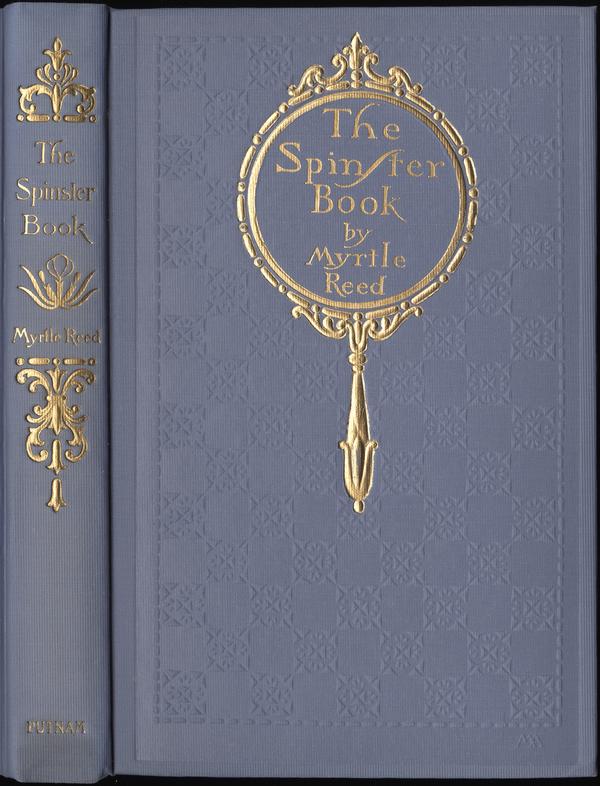
| The Spinster Book. Putnam, 1901 (1911 printing). |
 |
| Lavender and Old Lace. Putnam, 1902 (1905 printing). |
 |
| The Master’s Violin. Putnam, 1904. |
 |
| Atthe Sign of the Jack o’ Lantern. Putnam, 1905 (1907 printing). |
 |
| ASpinner in the Sun. Putnam, 1906 (1907 printing). |
 |
| LoveAffairs of Literary Men. Putnam, 1907 (2nd printing). |
 |
| Flowerof the Dusk. Putnam, 1908. |
 |
| OldRose and Silver. Putnam, 1909 (1910 printing) |
 |
| Masterof the vineyard. Putnam, 1910 (2nd printing). |
 |
| AWeaver of Dreams. Putnam, 1911. |
 |
| The White Shield. Putnam, 1912. |
 |
| Threads of Grey and Gold. Putnam, 1913 |


Portion of backstrip from the gray cloth binding of Love Letters of a Musician on left (Sept. 1901, 9th printing) on left and from a lavender cloth binding issue (from Oct. 1912) on right. The ornament on gray cloth matches that used on the Later Love Letters, but the ornament on the right is different and represents a later backstrip design. As a point of interest, note the contrast in brightness between the gold embossed design on the cover (below) and the ornaments and lettering on the spine in the full binding picture. The dullness of the spine ornaments is due to the use of “Dutch metal” (also called “Dutch gold”) rather than gold on the spine. Dutch metal is a copper and zinc alloy which is much cheaper than gold but tarnishes more or less rapidly depending on the environment, type of material on which it’s used, and the type of foil used.(6)

 |
| The Shadow of Victory. Putnam, 1903 (1911 printing). |
 |
| Happy Women. Putnam, 1913 (published posthumously) |
Whether the falling off—for there is one—is due to the apathy of publishers, or to lack of skill on the part of artists, is a question that can hardly be discussed in an essay dealing with the general aspect of the case. But after a careful review of the principal book-covers produced during the last few years in the United States, I am driven to the conclusion that no progress has been made, that the designs, when not comparatively feeble and ineffective, are imitative of work done on this side of the Atlantic; and that the typical examples selected for the illustration of this essay compare somewhat unfavourably with those in the reviews of similar designs by artists of British and other nationalities, which accompany it.

If only publishers had paid attention, our lives would be less frustrating!


The second group of “complications in variety and priority of bindings” analyzed by Gullans and Espey are not evident from the illustrations above, as all of those are in lavender or gray cloth issues. To summarize the difficulties, Putnam issued the first three titles in cloth only. The fourth, Lavender and Old Lace, was issued in cloth or full leather (in box). The next year (1903) the first and fourth were issued in four bindings, cloth, antique calf (9), red leather, and lavender silk cloth, while the second and third were issued in the first three bindings only. The following year, The Masters Violin was issued in all four bindings when first published, as were all subsequent titles in the series as they were published.
 |
| From Publishers Weekly, Jan. 31, 1903 |
 |
| Ad for The Master’s Violin, from Publishers Weekly, Oct. 1, 1904 |
.

 |
| Advertisement from Publishers Weekly, Nov. 24, 1900 |


Wait, There’s something very familiar about that dot-and-floret border…

…It’s our old friend from the Vicar of Wakefield, published three years later!
Finally, the only example of a box in which the antique calf issue was sold that is in our collection (below left), and a cloth color variant going back to Reed’s first two books—gray cloth as with the Love Letters titles. We have one other title, The Master’s Violin, which was issued in gray as well as lavender cloth. This leads me to wonder just how many of Reed’s other books were also issued in gray or some other color of cloth (The Master’s Violin is described below and I’ve seen an example of A Spinner in the Sun).


The last of these is difficult to see, even under magnification, but it’s present on all slipcases we have in the collection.
Before we move on, I must share an advertisement for this book which I found in the June 27, 1903 issue of Publisher’s Weekly.

“A perfectly exquisite tale, simple, genuine, affecting and, rarest of all, fragrant.”–Boston Herald.
“Fragrant!” If I didn’t know better I might suspect the Boston Herald reviewer of waggishness. No matter—Reed’s first novel was an immediate success and by the time that The Myrtle Reed Year Book was posthumously issued shortly after her death in 1911, it had “long since passed its fortieth edition.” (12)
 |
| Vignette from The Spinster Book |
The first printing was also issued in green cloth, and shared a feature with At the Sign of the Jack o’ Lantern, published four years later in September 1905. Like it, The Spinster Book used a cloth that was not only grained with the vertical rib pattern used for the series, but was also embossed with an additional checkerboard pattern.

 |
| 1911 printing |

 |
| First printing, 1901 |

Here are both the slipcase and the dust jacket for our 1911 printing of The Spinster Book. The slipcase has the three features mentioned above, while the dust jacket includes a blurb in addition to the cover design on the front, a blank spine, and advertisements on both flaps and the back.


 |
| Or one could just whack him with the master’s violin |
 |
| Publishers’ Weekly, August 13, 1904, p. 293. |
Our final color variant is on Threads of Grey and Gold (1913), this one not noted by Gullans. This was the final Myrtle Reed book with a design by Margaret Armstrong and the third in the series to be published posthumously. The book is a collection of periodical pieces by Reed and is dedicated to “The Readers of the romances of Myrtle Reed. A world-wide circle comprising probably not less than two million sympathetic admirers.” Here a dark purplish-red has been substituted for the pink of the blossoms. Unfortunately the scans seem to indicate that the pink flower issue is on a light blue cloth and the purple flower variant is on lavender cloth; in truth, the pink flower issue is also on lavender cloth, though it is a little more pale than the variant, once again demonstrating that a live viewing is a far superior experience.


To summarize Margaret Armstrong’s use of color inks on the Reed series, only white, purplish-red, pink, pale green and pale yellow were used to create the designs, along with gold or silver. Of the 12 designs, 1 used only gold, 5 used gold and white, 3 used gold (or silver) and one other color than white, 2 used gold, white and one other color, and 1 used gold, white, and two other colors. This means that to achieve her design effects, 9 of the 12 designs used only gold or gold and one other color, and of the remaining three, two were for posthumous publications, with the most complex (in terms of colors used) published only a couple of months after Reed’s death.(14) In fact, the two posthumous bindings pictured below contain her complete palette for the Reed series, including the gray cloth variants.


The final design we’ll take a look at is A Spinner in the Sun (1906).

 |
| Miniscule monogram on Spinner. |
This leads to several questions, which include how drastically was the design changed? (We do not have PTLA (Publishers’ Trade List Annual) and it hasn’t been digitized, alas.) Why was it changed? This seems to be a publisher decision—was there something about the design that was not acceptable, something that Armstrong was not willing to change (or was not given the chance)? And, of course, the most nagging question is, who was SH? Even though Strange’s plea for the “importance of signed handicraft-work” was answered, the mystery still exists over a century later.


The last four books by Reed published by Putnam bear out Gullans and Espey’s conclusion quoted earlier: that when she declined to continue series, the publisher would use others to design in the style of the series. We’ve already seen the re-used design for Happy Women (1913), originally used on Love Affairs of Literary Men with the title lettering on the cover supplied by someone else. Since we strive for completeness, here are images for the other three Putnam titles: two posthumous collections of previously published material, and a short, previously unpublished manuscript (A Woman’s Career).(16)
 |
| A Woman’s Career. New York: Putnam, 1914 |
 |
| The Myrtle Reed Year Book. New York: Putnam, 1911 |
 |
| The Myrtle Reed Cook Book. N.Y.: Putnam, 1916 |


 |
| Title page verso of seventh printing, 1911 |
 |
| Portrait from Threads of Grey and Gold, 1913. |

Until next time!
*****************


6). Roberts and Etherington. Bookbinding and the Conservation of Books. “Dutch gold.”
 |
| Detail of yapp edge |
 |
| Elbert Hubbard. The man of sorrows |
10). Variants of Rip van Winkle
.


11) Recently I re-watched “Se7en” with Morgan Freeman and Brad Pitt. Obviously I still haven’t gotten over the ending and go all Brad Pitt when anyone mentions boxes.
“The man in love with himself need fear no woman as a rival.”
“Marriage is the cold potato of love.”
-The White Shield (not seen)


Leave a comment